‘’The Princess and the Grain of Rice,’’ written by Tina Cho and illustrated by Honee Jang, is scheduled for release on Feb 10, 2026. This illustrated story offers a warm and simple reimagining of the classic tale ‘’The Princess and the Pea,'' focusing on careful observation and inner awareness, and showing how even the smallest things can reveal something meaningful.
In the mountains of Joseon, Jeongsoon is kindhearted and gentle, though famously clumsy. Dreaming of becoming a princess, she takes part in the grand princess challenge, which includes the Manners Test, the Wisdom Test, and the Sleep Test. While she struggles through each trial, her honesty and authenticity ultimately earn her the queen’s favor and victory in the competition.
Honee Jang is a Korean American illustrator and a picture book designer. She studied illustration during her college years and began her full-time job as a picture book designer at HarperCollins in New York. Honee loved the industry so much, and when she moved to London in 2020, she expanded her practice to illustration to further pursue her love for picture books.
She was awarded Creative Quarterly 43: Fine Art-Professional Winner in 2016 and was a Chosen Winner in American Illustration 34 in 2015. Her artwork has been exhibited in galleries across the United States, with shows such as ‘’Power in Numbers 7’’ at Nucleus Gallery in Alhambra, California (2022), as well as at BFP Landscapes in Brooklyn, New York (2016), the ‘’Euro Lounge’’ at the Pa-Nash Exhibition in Queens, New York (2014), and the ‘’100 Artists Show’’ at Ouchi Gallery in Brooklyn, New York (2014).
Other works by Honee Jang include illustrations for Emily Calandrelli’s ‘’Reach for the Stars’’ and Andy Holloway’s ‘’My Football Family.’’
Below are excerpts from an email interview with her between May 26 and Jan 20, discussing her illustration style and the illustration of the picture book ‘’The Princess and the Grain of Rice.’’
1. Is there something special or recognizable about your illustration style?
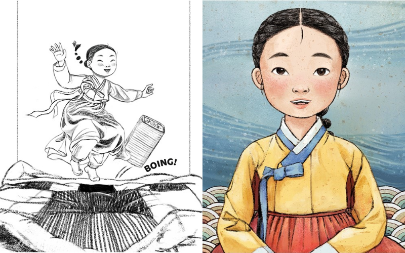
I adapt my approach depending on the needs of each book, so the techniques may vary, but my priority is always to find a genuine tone and mood that feels true to the story. I focus on establishing a clear sense of place and character, and on capturing something real about what a character might be feeling or going through in a particular moment. It’s important for me to capture the subtle body language and the surrounding environment in a way that feels natural and cohesive.
Visually, I’m drawn to muted warmth, rounded forms rather than sharp or edgy ones, and an overall sense of emotional comfort without becoming overly sweet. I tend to favor observed facial features over highly stylized forms, and prefer to capture how a character feels rather than how they appear.
2. How did you get picked to be the illustrator for ‘’The Princess and the Grain of Rice" by Tina Cho?
I had previously worked with the same wonderful art director, Aram Kim, on my debut book, ‘’Reach for the Stars.’’ During that time, I expressed my interest in illustrating a book rooted in the Korean cultural context, and I believe that may have been one of the factors that led Macmillan to consider me as a potential illustrator for this project, along with their awareness of how I work and my familiarity with Korean culture.
I'm very grateful to the editor, Grace Kendall, the art director, Aram Kim, and the designer, Melisa Vuong, as well as to Tina, for trusting me to bring this story to life.
3. What made you excited to work on the illustrations for this book?
While working in publishing, I became more aware of the growing number of Asian immigrant voices creating picture books, and I felt a strong need for more Asian stories. Like many Asian Americans growing up in the US, I remember spending time in the library searching for familiar surnames such as Parks, Kims, and Lees, in hopes of finding a story that reflected how I felt, and often coming up short.
Around the time I joined HarperCollins, Black voices were finally gaining visibility in the industry, which gave me hope that Asian voices would soon follow. When books like Joanna Ho’s ‘’Eyes that Kiss in the Corners’’ and Robin Ha’s ‘’Almost American Girl’’ appeared, it made me confident that the time had already arrived.
I was already familiar with Tina’s beautiful book, ‘’The Ocean Calls,’’ a story about a haenyeo and her granddaughter. So I knew I had to accept the offer when I received the manuscript for ‘’The Princess and the Grain of Rice.’’ It is a Korean-inspired retelling of ‘’The Princess and the Pea,’’ set in the Joseon dynasty, following a kind-hearted girl named Jeongsoon (modeled after Queen Jeongsoon) as she goes through a princess competition that tests her character rather than her status.
The visuals came alive immediately; the yellow jeogori, the orange-red chima, and a curious, sincere girl who genuinely wants the best for her people. As a child, I was also personally drawn to the story of Queen Jeongsoon answering the questions, “What is the deepest thing in the world?", and “What is the most beautiful flower?” (to which she replies cotton flower, for it keeps people warm through winter).
I was especially excited to highlight Korean values such as jeong, respect for elders and all living beings, and modesty. I loved the idea of setting the story in the Joseon dynasty, which allowed me to explore a culture I love so much, and retelling Queen Jeongsoon’s test through the lens of a familiar Western folktale in a way that felt both fresh and relatable.
4. How did you collaborate with Tina Cho during the illustration process?
Our editor, art director, and designer acted as the main bridges between Tina and me throughout the illustration process, so most of our communication flowed through them until the book was finished. This exchange of ideas was inspiring and helped me better understand Tina’s intentions behind certain scenes and clarify visual details.
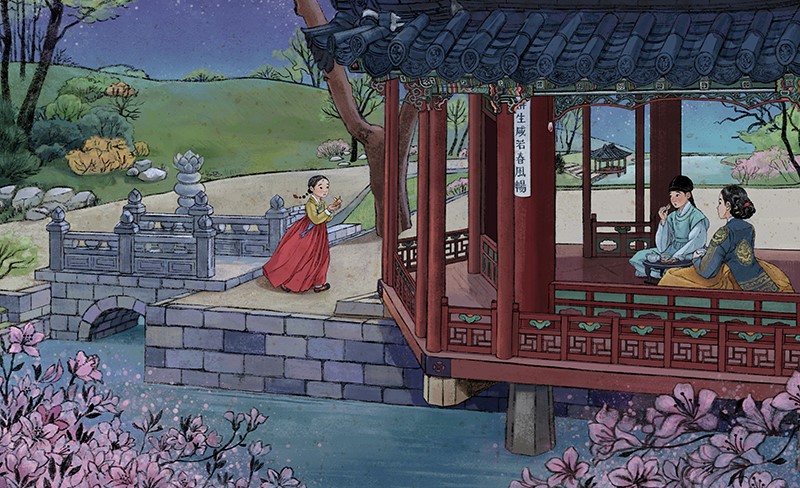
One of my favorite examples is the scene where the prince shares food with a small mouse at Jeongsoon’s request. In the original text, he offers cabbage leaves from his midnight snack, but to reflect something more authentically Korean, and to tie back to the book’s central theme, I suggested hangwa instead. Tina loved the idea, and we were both happy to showcase not just Joseon-era manners, architecture, and clothing, but also food.
We collaborated more directly during promotional projects, especially on our teacher’s guide and activity book. Tina was a wonderful partner not only because of her deep knowledge of Korean-inspired storytelling, but also because she is an elementary school teacher who has taught in both the US and Korea. Her perspective on how children learn and what the teachers expect from picture books is invaluable, and I’ve learned a lot from working on the teachers' guide and activity ideas together.
5. Can you tell us how you made the illustrations? Are they digital, hand-drawn, or a combination? Why?
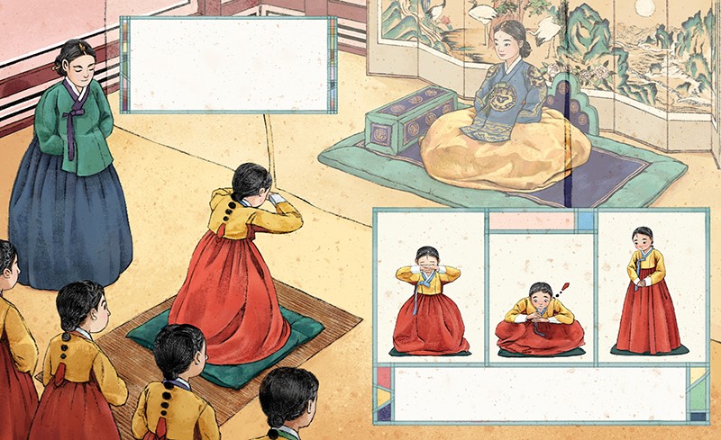
For some time, I've felt drawn back to traditional media, and this project felt like the perfect opportunity to explore that sensibility. The work was created digitally to keep it flexible for edits, but I wanted to create a strong, hand-drawn, folky quality that feels carefully made and gently worn by time.
So I aimed for a flat, calligraphic style that emulates art from the Joseon period while remaining modern and child-friendly. I used rough black outlines that feel like calligraphic brushes, and charcoal or crayon-like textures to flatten the color shapes. This helped evoke the feeling of traditional painting.
To replicate the subtle texture of traditional rice paper–historically made from mulberry pulp- I experimented with various surfaces. Surprisingly, a photograph of a white concrete wall worked beautifully to achieve that right texture.
6. How much time did you spend creating the illustrations, and were there any setbacks?
From start to finish, the project took just over a year, including time for feedback and revisions from the publisher and Tina. There were a few longer gaps between turnarounds, which could be seen as a setback, but it ultimately worked in my favor because they allowed me to research more deeply into elements I wanted to explore further. That level of time and opportunities for revision felt like a privilege in today’s picture book-making process.
I also had a brief opportunity to visit Korea right before the project began due to a family matter. During the time I had there, I gathered as many primary resources as possible, including in-person visits to the palaces such as Gyeongbokgung and Changdeokgung, royal museums, and Uijeongbu Music Art Library with rich materials on Korean architecture, furniture, clothing, and painting. I love digging deeply into research for every book I make, but this project involved the most extensive research I’ve done so far.
7. What was your favorite scene to illustrate in ‘’The Princess and the Grain of Rice,’’ and why?
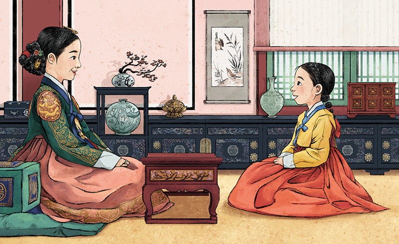
I love the scene when the Queen and Jeongsoon face each other in profile. Their relationship is echoed in Sin Saimdang’s painting of two birds making eye contact in the background wall. The subtle cherry blossoms in the room hint at the positive news the Queen is about to share.
8. How do stories like this help people understand Korean culture?
I hope young readers feel proud of their heritage and see the deep cultural roots behind K-dramas, K-pop, and Korean storytelling. I also hope they notice how our people in the past lived differently, but still shared the same core values we hold today, such as kindness, authenticity, and empathy. At its heart, this story shows how Koreans form connections through care and consideration for others, often described by the concept of jeong.
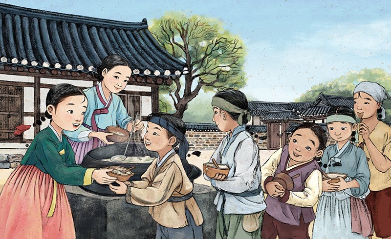
However, while jeong is a Korean term, the sentiment itself is not uniquely Korean. I’ve seen this depth of connections across cultures and borders, and I believe that recognizing our shared values with people within and outside Korea, while also understanding our differences, broadens our sense of humanity. By weaving together the historical practice of princess selection during the Joseon dynasty with the Western fairytale, ‘’The Princess and the Pea,’’ the story creates a bridge that strengthens our connection with readers around the world. I hope this is the key takeaway readers will carry with them as they read the book.
Honee Jang’s insights reveal the care, creativity, and attention to detail behind the illustrations of ''The Princess and the Grain of Rice.'' Her thoughtful work demonstrates how illustrations can enrich the story and strengthen a reader’s connection to it.
How about this article?
- Like0
- Support2
- Amazing0
- Sad0
- Curious0
- Insightful0


