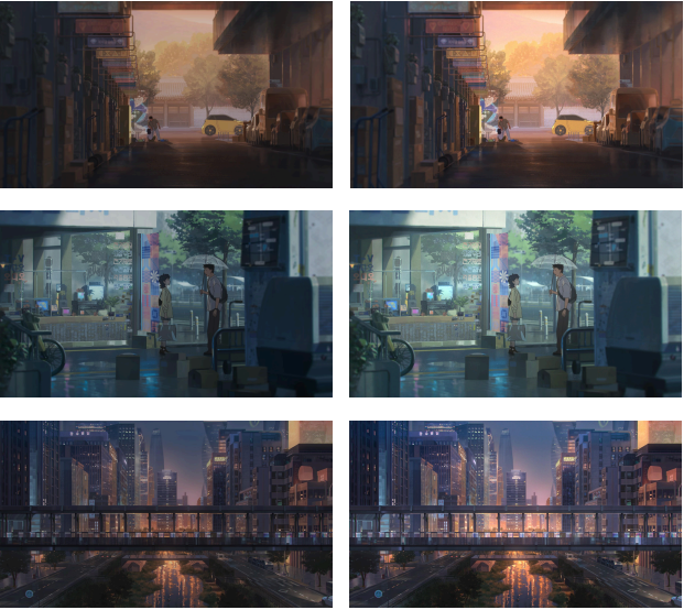
Lost in Starlight is an extraordinary animation that captivated me from the very first scene. Its portrayal of a futuristic Seoul, blending real-life locations with imaginative, forward-looking elements, creates a world that feels both familiar and astonishingly new. The animation’s attention to detail—from the motion graphics to the subtle emotional expressions of its characters—makes it not just visually stunning, but also emotionally immersive. What impressed me most was how convincingly the animation merged futuristic imagination with a sense of reality. Every movement, every scene, and every emotion felt grounded and authentic, which led me to wonder: what makes the emotions in animation feel so real, and how is this achieved? I became especially curious about the role of the colorist in shaping the emotional depth and atmosphere of the work. Through my research, I discovered the talented team behind this realism, and I was fortunate to have the opportunity to interview the colorist of Lost in Starlight, gaining firsthand insight into how color and light were used to bring the animation’s world and emotions to life.
‘Dexter Studios is renowned for its innovative work in animation and post-production. Could you share a bit about the studio’s philosophy and what drives your passion for digital intermediate (DI) and color grading work?
Our DI team doesn’t view DI and color grading as merely technical processes. We focus on delicately tuning color and light so that the emotions and atmosphere of a piece are fully conveyed to the audience, adding depth to every frame. We understand how a single shift in hue or tone can influence the entire story. That’s why, for every project, we carefully consider the director’s vision and the flow of the narrative to ensure that the emotions and mood emerge naturally. Our greatest passion and pride come from approaching every stage of DI and color grading with care and dedication—so that the inherent power of each work can shine even more brightly.
How does Dexter Studios distinguish itself in the highly competitive field of animation post-production, especially with projects like Lost in Starlight?
Our DI team has built extensive experience through consistent color grading work across various genres and media, including films, OTT content, and animation. Throughout this process, we’ve developed the ability to go beyond specific genres or styles, offering creative color grading solutions that best suit the unique characteristics and directorial vision of each project. Because we have a deep understanding of the distinct features of different media and global trends, we’re able to approach our work with flexibility and a broad perspective. In emotionally rich and futuristic projects like Lost in Starlight, this approach allowed us to effectively capture and enhance the atmosphere and emotional tone of the story. We believe that our greatest strengths as the Dexter DI team lie in this adaptability—finding the most fitting visual solution for every project—and in our meticulous attention to detail that elevates the final quality to its highest level.
As the colorist for Lost in Starlight, could you introduce yourself and describe your personal journey into this field and what this project meant to you?
I’m Shin Jeong-eun, a colorist on the Dexter DI team. I majored in visual design and began my career in a film production design team. It was there that I first witnessed how the artistic elements captured in each frame could come to life even more vividly through the color grading process—an experience that sparked my interest in this field. I was deeply drawn to the way color and light can enrich and deepen the emotions and storytelling of a work, which eventually led me to pursue color grading as my professional path. Lost in Starlight holds special meaning for me. The process of expressing its futuristic yet lyrical atmosphere through color was both a precious challenge and a reminder that color grading is not just a technical step, but a creative process that brings greater emotional depth and resonance to a story.
The film’s visuals struck me as remarkably sharp, vibrant, and romantic — they truly brought the story and characters to life. How did you craft such a rich and emotive
color palette that feels both intimate and cinematic?
For this project, we conducted color grading in an HDR environment. By taking advantage of HDR’s wide range of brightness and color, we aimed to enhance the sense of depth and spatial presence, making the audience feel as if they were truly inside the world of the story. Our approach was to maintain the original low-contrast, lyrical atmosphere while adjusting brightness and adding subtle lighting effects to bring the visuals to life. Additionally, we carefully refined tones and colors according to the emotional flow of the characters and spaces, striving to immerse the audience fully in the story.
Lost in Starlight is set in a futuristic Seoul 2050, and the atmosphere felt so immersive that I felt transported there. How did your color grading help capture the spirit and unique vibe of Seoul’s futuristic yet familiar world?
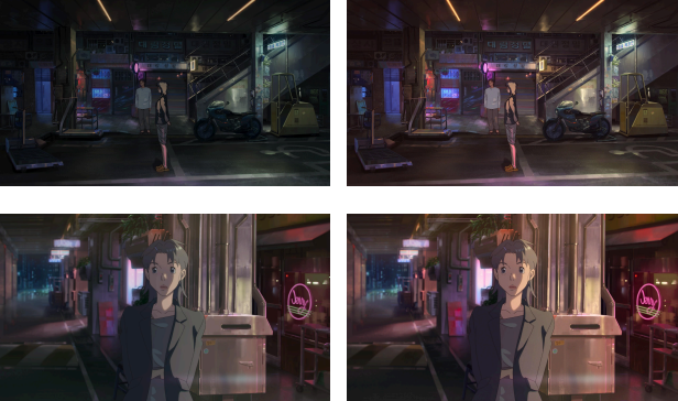
When I first watched this animation, I was struck by how the real-life locations and futuristic elements blended seamlessly, presenting a version of Seoul that felt both familiar and new. The addition of futuristic layouts on top of recognizable spaces gave the city a sense of plausibility, as if this could truly be Seoul in the future. I focused on ensuring that this impression was fully conveyed through the color grading. In particular, I carefully adjusted tones and colors so that the city’s depth and the glow of countless holographic neon signs would naturally permeate each frame. At the same time, I minimized any overly distracting elements, allowing the audience to fully experience the feeling of exploring a futuristic Seoul.
Could you walk us through your creative process during the DI and color grading phases? How do you balance technical precision with artistic storytelling in your work?
DI and color grading are where technology and artistry meet with precision. We paid close attention to adjusting colors in a way that maximizes the director’s vision and the storytelling. Scenes with continuity issues were carefully balanced, and overall, we conducted extensive tests and fine adjustments to preserve the low-contrast, lyrical feel while taking full advantage of HDR’s capabilities. Ultimately, our primary goal is to enhance technical excellence on top of artistic expression, ensuring that the emotional and visual impact of the work is fully realized.
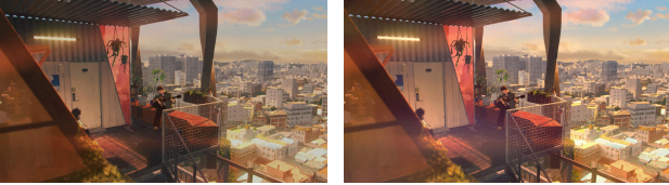
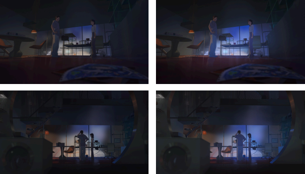
The image above is from a scene that conveys romantic emotions, which the director had noted felt somewhat lacking in mood and continuity in the original footage. During post-production color grading, we worked to align the continuity as closely as possible and adjusted the lighting to match the director’s vision. As a result, the scene was completed with a richer mood and more expressive emotional impact than the original.
This is a scene that highlights the glow of a pink electronic billboard. We enhanced the lighting mood by carefully adjusting the light and color, while naturally aligning the continuity, so that the storytelling could be fully maximized.
Were there particular moments or scenes where color grading played a pivotal role in amplifying the emotional impact or narrative tension? Can you share an example?
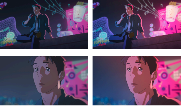
This is the scene where Jae sings for Nanyeong. It was important to convey the warm atmosphere and emotional connection between the two characters naturally. We enhanced the colors to make them warmer and emphasized the quality of the light, allowing the emotions to come through more vividly. This approach helps the audience fully experience the feelings and lingering impressions shared between the characters.
This is a scene where tensions rise between the two characters during an argument. We deliberately emphasized the blue glow from the billboard outside the window as it filters into the room and increased the contrast to visually highlight the sharp emotions between them. This approach enhances the scene’s tension and dramatic atmosphere, making it more impactful for the audience.
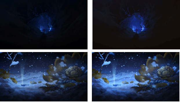
This is the scene of Nanyeong isolated in outer space. We added color to the predominantly monochromatic base of the space environment to enhance depth and spatial perception, emphasizing her sense of instability and isolation. This approach allows the audience to immerse themselves more fully in Nanyeong’s situation and the environment she is in.
From your perspective, what makes Lost in Starlight visually unique compared to other animated films, both within Korea and internationally?
I believe the most distinctive feature of this work is how it combines imagination with real, iconic locations in Seoul, creating a unique visual landscape where reality and the future coexist in a layered, immersive way. Additionally, the story’s journey between a futuristic Seoul and outer space allows familiarity and novelty to coexist, while a universal love story unfolds with a touch of retro sentiment—an especially captivating aspect of the project. My focus was on carefully adjusting color and light to refine the depth and atmosphere of each scene, ensuring that the emotional flow and narrative resonance linger throughout the entire visual experience.
In your experience, how important is color grading in animation for enhancing storytelling and making characters and moments feel truly alive, especially in a film with a romantic and fantastical theme like Lost in Starlight?
I see color grading as a kind of conductor that helps the emotions and atmosphere of a work naturally reach the audience. It gently connects the emotional flow of each scene and the mood of the spaces, carefully supporting the director’s vision and the original work’s impact. In projects with romantic and fantastical themes, like Lost in Starlight, even subtle changes in color or light can influence the overall mood and emotional trajectory, making meticulous adjustments during the color grading stage especially important. Ultimately, I believe color grading plays a crucial role in ensuring that the story and emotions come alive, delicately supporting the emotional rhythm across the entire scene.
What were some of the most challenging technical or artistic obstacles you faced during this project, and how did you and the team overcome them?
The biggest challenge in this project was finding the right balance between preserving the low-contrast, lyrical atmosphere of the original footage and enhancing depth and dimensionality in an HDR environment. If the contrast is too high, the delicate mood can be disrupted; if too low, the sense of space can feel flat. Achieving this balance required careful consideration and repeated experimentation. For daytime city scenes, we refined the visuals to maintain spatial depth without increasing contrast, while for nighttime scenes, we highlighted the vibrant city lights and futuristic elements without introducing harsh contrasts. In outer space scenes, we meticulously adjusted light and color to preserve the original emotional tone, allowing the audience to fully immerse themselves in the environment and the character’s experience. Through this process, we were able to create a final result where technology and emotion coexist in harmony.
Collaboration is key in animation — how did you work alongside lighting artists, VFX teams, and directors to ensure a cohesive and striking visual identity?
For this project, color grading was carried out in the DI room after the main animation production was completed, using the finalized data. However, during the production process, we conducted several tests and discussions to determine the extent to which adjustments could be made in the post-production stage, and which elements—such as grain and lighting—could be effectively applied during color grading once the data was finalized.
Did you experiment with any new tools, techniques, or creative ideas during this project that helped push the boundaries of traditional animation color grading?
In this project, we experimented with new approaches in addition to traditional color grading techniques. In particular, even though it’s an animation, we aimed to give it a cinematic feel and texture by incorporating grain and exploring emotional effects with light diffusion. We also fully leveraged the HDR environment, conducting multiple tests to enhance the depth and detail of each frame. We believe these approaches greatly contributed to expanding both the visual sophistication and the emotional range of the work.
How important is color grading in animation to make characters and environments feel alive, especially in a romantic and futuristic setting like Lost in Starlight?
In an animation with a romantic and futuristic world, color grading goes beyond simply making the visuals beautiful—it’s a crucial process that helps the emotions of the story and the atmosphere of the world naturally reach the audience. Subtle shifts in color and light can transform familiar spaces into entirely new worlds, making futuristic or fantastical scenes feel convincing and immersive. In particular, for this genre, color grading serves to clarify the emotional tone and spatial sense of each scene, while deepening the story and enhancing audience immersion. When grading, I always respect the director’s vision, the story, and the characters’ emotional arcs, approaching each frame with care to ensure color and light blend naturally. Ultimately, I see color grading as the final touch in animation—a creative process that breathes life and energy into the entire frame so that the work’s message and emotions can be fully conveyed to the audience.
Looking ahead, how do you see Dexter Studios’ DI and color grading work influencing the future of Korean animation and its reception on the global stage?
It’s difficult to predict exactly what impact our DI and color grading work will have in the future, but as always, we approach each project with responsibility and give our best to fulfill our role. We hope that through the accumulation of these efforts, the color grading and visual quality of Korean animation will continue to grow, leaving a positive impression on an ever-wider audience. We also hope that Korean animation can be loved on a broader stage, and that, in some small way, we can contribute to that journey.
Finally, what emotional or sensory experience do you hope audiences take away from the colors, tones, and moods you created for Lost in Starlight?
Through this work, I hope the audience experiences not just the vibrant colors or technical polish, but the depth and lingering resonance of Seoul’s future, the characters’ emotions, and the atmosphere of each space seamlessly blending together. I approached the project with the hope that viewers would feel as if they are traveling through Seoul and space in 2050, carrying with them the stories embedded in each frame for a long time. It is my sincere wish that everyone who experiences this work as an audience member takes away a truly memorable and special experience.
This interview was conducted via email from June 10 to July 16, 2025.
How about this article?
- Like5
- Support2
- Amazing0
- Sad0
- Curious0
- Insightful1