[Interview] Beyond the 'Extraordinary': Inside the design studio behind BTS album covers and Korea’s iconic brands
2025-09-04The creative force behind some of your favorite K-pop albums and well-known brand visuals seen across Korea and beyond goes by a surprisingly modest name.
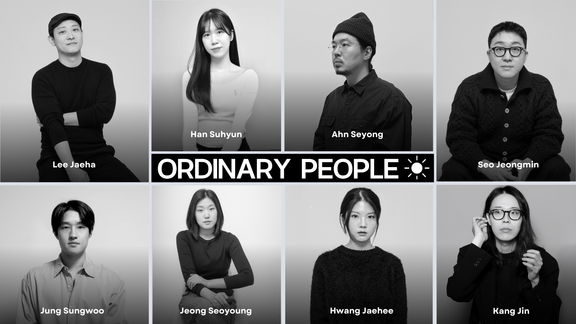
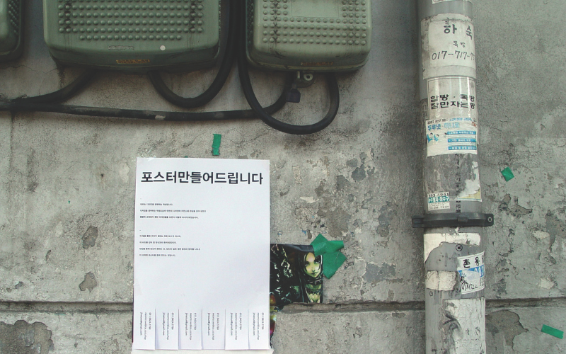
Founded in 2006 by a group of graphic design students from Hongik University, Ordinary People is a Seoul-based multi-disciplinary design studio specializing in brand strategy and art direction. What began as a self-initiated college project among friends, offering free design work for non-profit events under the name ‘We Make Posters,’ has since evolved organically into a full-fledged creative studio with a team of 10 members, steadily building a reputation for delivering thoughtful and visually impactful work across cultural and commercial sectors.
The studio is best known for its art direction, album packaging and graphic design work for some of Korea’s biggest K-pop acts, including BTS, Tomorrow X Together, Jung Kook, J-Hope, Agust D, Enhypen, ATEEZ, NCT, and Astro’s Yoon San-ha. But their influence extends far beyond the music scene. From cosmetics and health brand like Olive Young to major cultural institutions such as Leeum and Hoam Museum of Art, and even leading platforms like Watcha and Netflix K-content, their work continues to shape recognizable and distinctive brand identities that are part of daily life for millions.
True to its name, which interestingly was inspired by John Legend’s 2005 hit Ordinary People that happened to be playing during a brainstorming session of the team, the studio is driven by a commitment to better, efficient, and exact communication, taking a grounded yet inventive approach to design.
Ordinary People approaches design through diverse and active experimentation—drawing from contemporary culture, visual language, and modern technology to craft compelling narratives and brand experiences. Their motto, “We the ordinary people aim for better, efficient and exact communication by doing various and active experiments,” reflects a process rooted in collaboration and curiosity rather than spectacle.
With a design philosophy that remains both experimental and grounded, the team continues to push the boundaries of communication design, quietly but powerfully shaping how Korean music, media, and brands are experienced by audiences around the world.
I first came across Ordinary People while researching standout design work in the Korean creative industry. Intrigued by their thoughtful, process-driven approach and wide-ranging portfolio, I reached out to the studio for an interview.
In an email conversation conducted between between March 20 and July 11, the Ordinary People team shared insights into their design philosophy, collaborative process, and the journey that has shaped them into one of Korea’s most influential design studios.
The name ‘Ordinary People’ has a disarmingly humble tone, especially for a studio with such an extraordinary impact. For Korea.net readers unfamiliar with your work, could you briefly introduce yourself and explain what inspired the name 'Ordinary People' ? How has its meaning evolved to reflect your design philosophy over time?"
We’re a multidisciplinary design studio based in Seoul and New York, founded in 2006 by a group of friends from university who shared a passion for visual culture and collaborative creativity. Since then, we've grown into a team of designers specializing in brand strategy, visual identity, and art direction across cultural, commercial, and institutional projects.
The name came to us in a very natural moment—while listening to John Legend’s song “Ordinary People” during an early brainstorming session. We realized it captured something essential about our approach: that great design doesn’t have to be flashy or loud. It can emerge from everyday experiences, thoughtful collaboration, and clear communication. Over time, “Ordinary People” has come to represent not just our humility, but our belief in the value of process, dialogue, and empathy. We try to approach every project, no matter how big or small, with care, curiosity, and an openness to new ideas.
Today, the name reminds us to stay grounded even as we work on high-profile or experimental projects. It encourages us to focus on clarity, sincerity, and designing with people in mind. That spirit still defines our philosophy and practice.
Ordinary People began in 2006 as a self-initiated student project, designing free posters for non-profit events under the name ‘We Make Posters’. What mindset drove you then, and what do you most vividly remember about that time? What shared vision brought you together, and how has that passion-driven beginning shaped the studio’s values and identity? Looking back, what kept the momentum alive as the project evolved into a full-fledged design studio with a distinct voice??
Ordinary People began not as a business plan, but as a shared impulse. In 2006, we were a group of college friends with a strong desire to design for real people, real events, and real contexts. Under the name ‘We Make Posters’, we offered to create posters for non-profit events—student gatherings, exhibitions, small performances—often for free. It wasn’t about building a portfolio; it was about connecting with our surroundings through design and seeing our work live in public spaces, not just inside classrooms.
What we remember most vividly from that time is the joy of making things together—staying up late experimenting with ideas, printing by hand, learning new tools on the fly. Creatively, it was raw and intuitive; personally, it was formative. We were figuring things out not just as designers but as collaborators and friends. There was no hierarchy, no rigid roles—just mutual respect, curiosity, and a belief that design could have a real presence in everyday life.
The vision that brought us together back then was simple but powerful: to work side-by-side, explore ideas freely, and contribute something meaningful, however small, to the culture around us. That early spirit still defines us. Even today, we value initiative, experimentation, and collaboration over polish or convention. We continue to seek out projects that leave room for new questions, fresh approaches, and respectful dialogue.
Looking back, the momentum came from the relationships we built—with each other and with the people we worked with. Trust, openness, and a sense of shared ownership allowed the project to evolve naturally. Over time, that foundation helped shape Ordinary People into a studio with a clear voice—but one that’s still growing, still learning, and still deeply rooted in its beginnings.
Each of your projects has a distinct feel, yet your work consistently captures the brand or artist’s essence with a clear voice. Could you walk us through how a typical project unfolds at Ordinary People—from initial brainstorming and design briefings to navigating creative differences and reaching team consensus? How do you balance internal cohesion with creative freedom, especially on high-stakes projects, and what do you think makes for a productive creative conversation along the way?
When working on a pre-existing project, we begin by immersing ourselves in its world—its narrative, structure, and intent. We try to stay with it long enough to understand its logic and emotional core.
In contrast, if the project does not yet have a concrete form, we stay close to its point of origin—the questions it raises, the tensions it holds. Through this process, we gather stories, materials, sensations, and speculations that converge under the name of the project. We then shape a concept that can most clearly articulate what has emerged. From there, we explore how to unfold this concept into a visual language.
We accept project inquiries via email, and whether or not we move forward with a project depends on several factors. First, we consider whether the subject genuinely interests us. We also evaluate whether the proposed budget and timeline are reasonable. Just as important is a sense of mutual respect between all parties involved.
Priority is given to members who express interest, and we decide who participates based on each team member’s availability and working conditions.
We place great importance on the “first proposal.” After thoroughly reading, observing, absorbing, and digesting the project brief, we formulate a proposal that reflects our interpretation and perspective. This initial proposal is not just a draft or visual idea—it’s a way of sharing our thought process with the client. We believe this first response can often signal the trajectory of the collaboration to come.
When a project involves multiple stakeholders, we try to conduct as many interviews as possible during the research phase, with the aim of establishing a shared understanding of goals early on. Still, some key elements only surface once the project is underway. We approach these through conversation—by persuading, being persuaded, and working things through together. Even when we encounter “unchangeable realities,” we don’t dwell in frustration. Instead, we focus quickly on what’s still possible, and on what we can do well right now.
To us, a truly creative and productive conversation is one that leads to mutual understanding through cycles of persuasion and openness. It’s not just an exchange of opinions—it’s a collaborative thought experiment where different perspectives collide, intersect, and evolve toward better answers.
How are ideas developed in your team while balancing creative exploration with clarity, and how do you ensure aesthetics don’t compromise the functionality of the design?
Ideas take shape differently for each project. In some cases, each member brings their own visualizations, developed in their own unique way, and we begin the discussion from there. At other times, we might start with just a few clues or questions and develop a concept together through conversation.
No matter how new or impressive the outcome may be, it must at the very least contain a narrative that all of our members can agree with. And we don't believe that functionality and aesthetic innovation are mutually exclusive — we believe there’s always a better answer to be found.
What are some guiding principles that help you adapt to such a diverse range of clients?
In most cases, clients possess more materials, memories, and experiences related to the project than we do. That’s why we begin by listening, learning, researching, and asking questions. Even as we immerse ourselves deeply in the project, we try not to lose the initial impressions and questions that arose when we first encountered it. We create by oscillating between immersion and distance. We learn from the project’s “before now” and offer answers for its “after now.” While the background or context of each project is often new to us, we have a strong grasp of what it takes to create a good outcome.
Beyond the world of design itself, where do you draw inspiration to keep your perspective fresh and expansive—whether from books, music, places, or everyday experiences?
We draw inspiration from a wide range of mediums and environments—books, music, films, places, and everyday life, as you mentioned. To give an example of how we gather hints for ideas: when watching a film, we approach it from two perspectives. One is as an audience member—what sensations or emotions I felt. The other is as a creator—imagining why the director ultimately chose a particular narrative structure and plot. Following both lines of thought together is helpful.
We’re also stimulated by the conversations we share as a team. We talk about recently viewed content, new hobbies, private feelings, or personal observations, vicariously experiencing each other’s perspectives. Through this sharing of interpretations, we arrive at expanded ways of thinking and seeing that we might not have reached on our own.
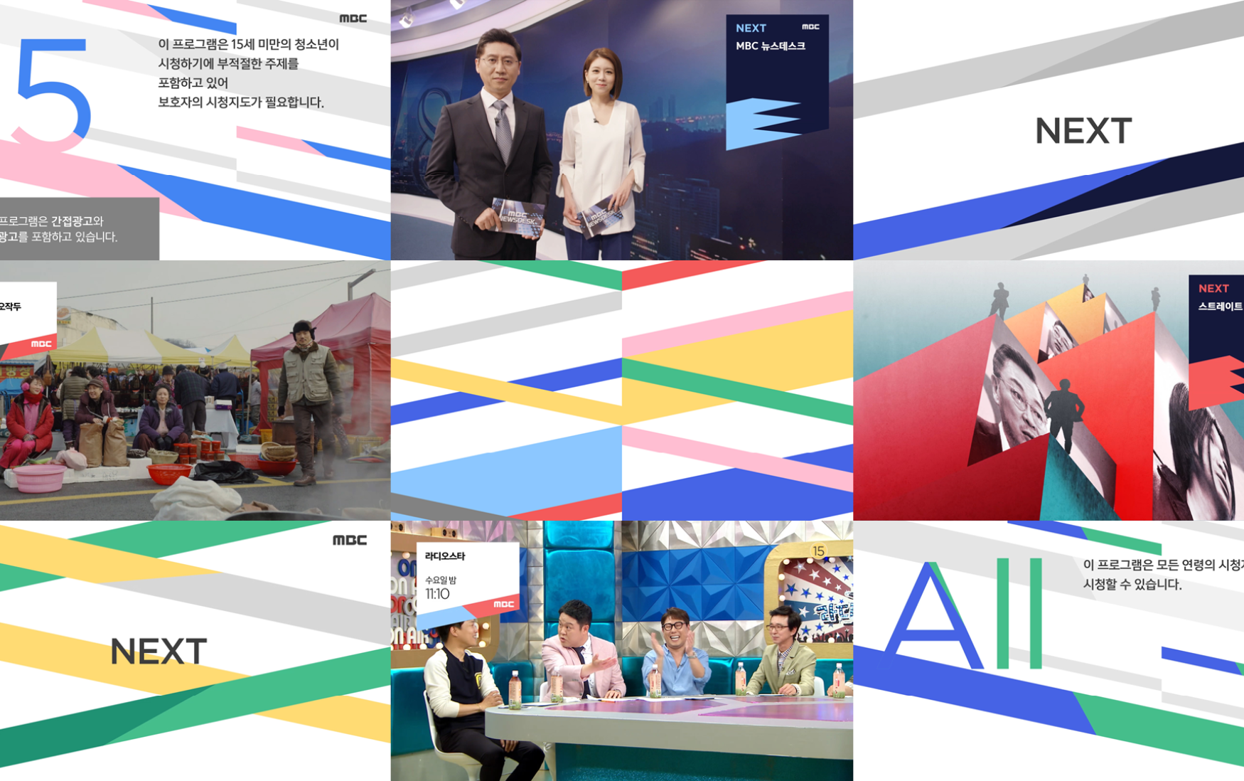
The 2018 MBC visual identity renewal project was a major milestone for your studio. Can you share your creative approach to rebranding such a legacy media institution? What challenges did you face in turning its broad, abstract concept into a clear visual language, and how did the project push your creative and technical boundaries?
We approached MBC’s rebranding with a clear focus on translating abstract values into a tangible and flexible visual system. The central concept was a graphical motif of “stacked layers,” visually representing the idea of “Stacked Time”—symbolizing MBC’s accumulated experience and evolving identity across decades of broadcasting. This motif was manifested through slanted, layered bars that could be applied across multiple media in a dynamic and adaptable way.
This identity system was not only aesthetic but also functional: it allowed MBC to maintain consistency across its diverse programming categories (news, drama, entertainment, etc.) while giving each segment a unique expression through variations in the stacked forms and color schemes. Given the nature of TV media, the identity system had to function seamlessly across motion graphics, static visuals, and digital platforms. We designed each element to ensure clarity and consistency in both animated and still formats.
The MBC project marked a shift for our studio—from graphic-based work to the development and management of comprehensive brand systems. It allowed us to apply a unified visual language across various media, including stationery, motion graphics, and signage. Most importantly, it validated our belief in concept-driven, experimental design and gave us the confidence to pursue bolder approaches in future projects.
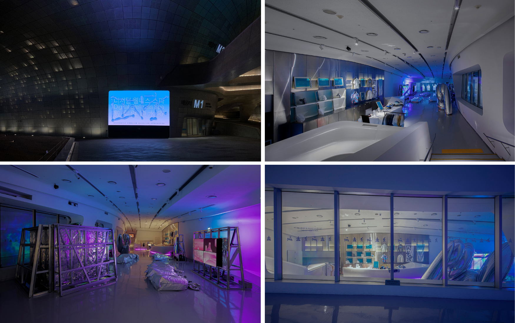
In 2021, you debuted ‘Digital Wellness Spa’ at DDP through the Open Curating project—your first foray into exhibition design and curation. What inspired the concept of digital leisure in a post-pandemic world, and how did curating shape or expand your design thinking? Unlike your commercial work, how did this project reflect something more personal from the studio?
In 2021, as physical movement and contact between people became restricted due to the pandemic, we began to feel the fatigue brought on by excessive exposure to digital devices. It was in this context that we started to imagine the paradoxical concept of “rest within the digital.” With travel and offline cultural experiences limited, we felt a growing need for alternative forms of sensory engagement. This led to the idea of constructing a virtual spa resort.
The project came to life through DDP’s Open Curating Program, which supported experimental and innovative exhibitions under the theme of “design beyond boundaries.” It was the perfect opportunity to explore the questions and creative urges we had at the time.
Taking on the role of curators ourselves, we delved deeply into the idea of designing narratives—not just visual identities. From spatial structure and visitor flow to visual language and the audience’s emotional response, every component had to be integrated into a coherent experience. This became a new kind of experiment and challenge for us, ultimately expanding our design thinking to embrace experience, context, and interaction on a broader scale.
The exhibition was built around a fictional digital spa resort, layered with works by various artists. As such, our studio’s personal presence was revealed only indirectly. In fact, we deliberately avoided foregrounding our studio’s name, instead inventing a fictional founder for the project. Despite this, we believe our contextual sensibilities and values inevitably emerged through the countless decisions made throughout the process of shaping the exhibition.
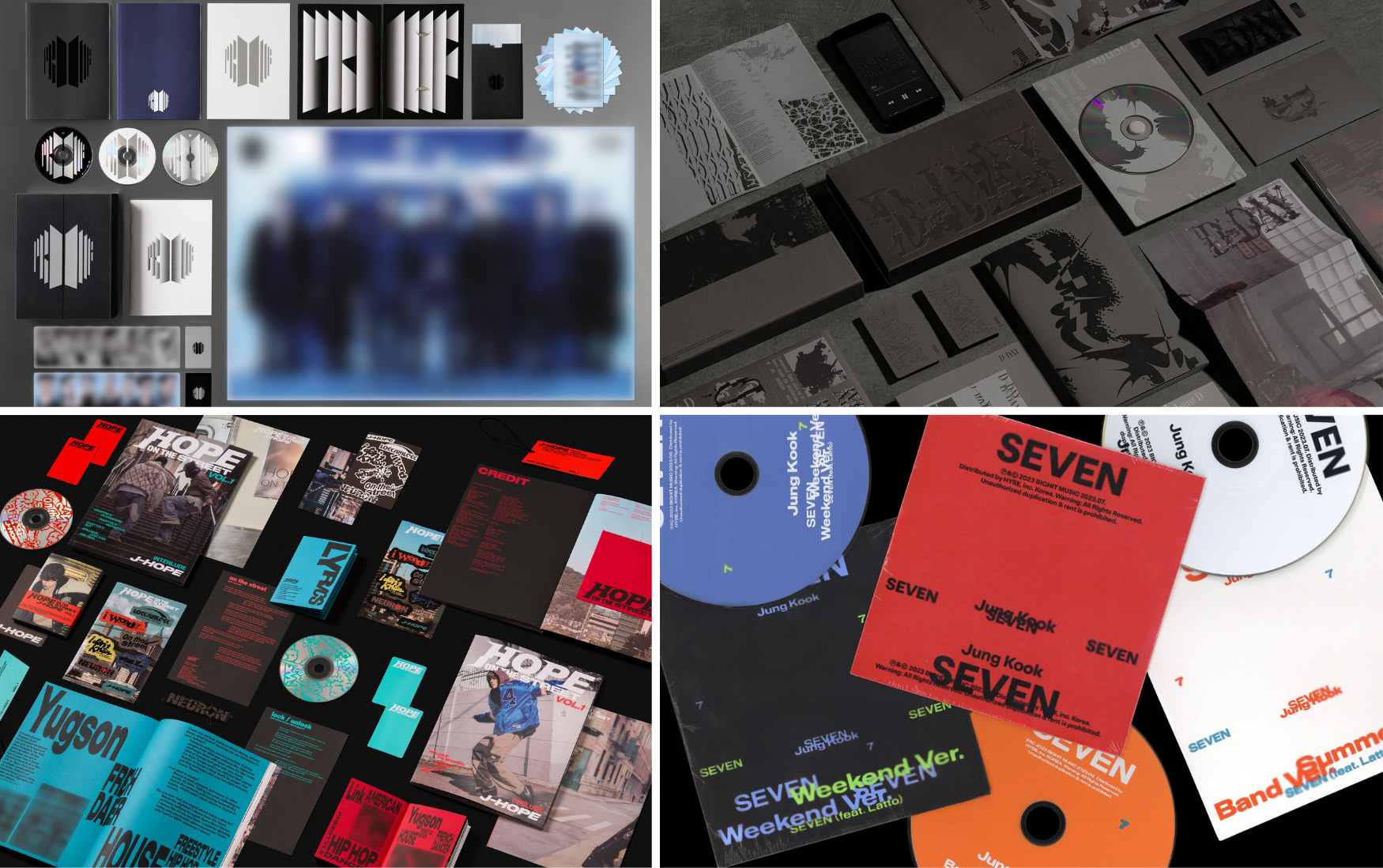
‘Proof’ (2022) was both a powerful reflection on BTS’s nine-year journey and a poignant moment of transition. How did you translate this emotional and historical narrative into the visual identity of the album? Could you walk us through your creative process—from interpreting the brief to finalizing the cover design—and explain how the BTS logo became a central symbol of ‘proof’? How did you balance your own creative vision with the conceptual direction given for such a major release?
Our approach to the anthology album was really about understanding and celebrating what this moment meant—for BTS, and for the fans, the people who’ve walked that journey with them. Proof wasn’t just a look back or a conclusion. It was a declaration—that everything they’ve built over the past nine years is real, meaningful, and still evolving. It’s both a reflection and a signal of momentum toward what comes next.
We knew early on that the BTS logo had to be at the heart of it. It’s always been a beloved symbol among fans, but for us, it also felt like a door—something that opens, invites, and leads forward. We saw it not just as a flat graphic, but as a space—a threshold between time and meaning. As we explored that idea in layers, both spatially and conceptually, it became clear that this portal into the next chapter could carry the full weight of the album’s narrative.
Working on such a high-profile project naturally comes with pressure. But in terms of our process, it didn’t fundamentally change how we work. We always strive to propose a focused, compelling direction. And when that vision is met with trust and thoughtful collaboration, it gives the work space to evolve into something even more meaningful.
Following ‘Proof,’ you worked on Jungkook’s ‘Seven’ (2023), SUGA’s ‘D-DAY’ (2023), and J-Hope’s ‘Hope on the Street Vol.1’ (2024)—each with its own distinct mood, identity, and narrative. How did you tailor your design language to reflect each artist’s unique persona and musical direction, while maintaining a coherent brand identity under HYBE? As a studio, how do you balance creative flexibility with consistency when working with artists who have such diverse global identities and artistic visions?
Each artist deals with distinct themes and musical styles, so naturally, different approaches were required when visualizing their unique identities. For instance, Jungkook’s Seven needed to emphasize a sense of global pop appeal and urban sophistication, whereas Agust D’s D-DAY focused on conveying deep inner wounds and introspection. Hope on the Street Vol.1 by j-hope was developed to highlight his roots as a street dancer and his musical freedom, allowing his personal narrative to come through vividly.
These projects were the result of close collaboration and ongoing dialogue between our studio, the artists, and HYBE, all working toward a shared vision. Our goal was to design visual language that functions not merely as packaging, but as an integral part of each artist’s storytelling.
In approaching such a diverse range of projects, what we strive to maintain consistently is not a fixed style of output, but our attitude toward the work. While typographic choices, color schemes, and layout compositions may vary from project to project, the visual systems we build are designed to clearly articulate brand identity while maximizing each artist’s unique expression.
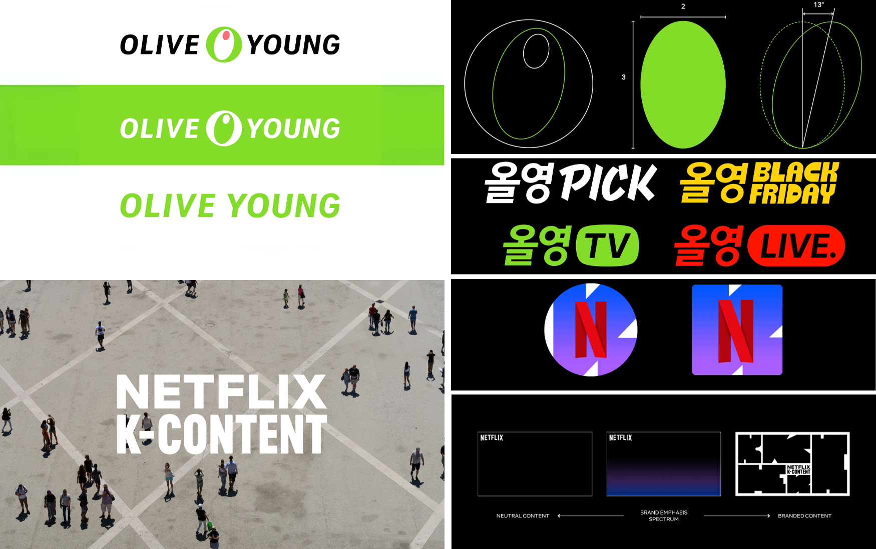
For the ‘Netflix K-Content’ project, you drew on the idea of a cultural square—an open, inclusive space of constant dialogue. How did this core concept guide your creative direction in capturing both fandom energy and cultural diversity? And how did it shape the evolving ‘K’ graphic into a flexible yet consistent visual motif across such a wide range of genres and voices?
We approached the project with the idea of a cultural square—an open, inclusive space where fans around the world gather and connect through K-content. That idea shaped everything. We designed the ‘K’ not just as a logo, but as a flexible frame that could adapt to different genres, moods, and fandom energies. It stays recognizable, but it moves—it grows with the stories it represents. For us, it was important to build a system that felt alive and shared, just like the global conversation around Korean content.
With ‘Olive Young,’ you weren’t starting from scratch but refining an established identity—respecting its consistency while allowing for individuality. What were the key creative challenges in that kind of refinement process? How do you balance cohesion and distinctiveness when designing visual identities that must align with a larger brand family yet still express their own personality?
When refining an already well-established identity like Olive Young, one of the biggest creative challenges was respecting the brand’s existing equity. The identity was already deeply embedded in the public's perception, so rather than starting from scratch, the goal was to introduce subtle yet impactful changes—modernizing the visual language while preserving key recognizable elements that users already trusted.
Another major consideration was ensuring consistency across diverse media environments. Olive Young operates across a wide range of touch points—from retail stores and packaging to online platforms. This meant the visual identity system needed to be precisely defined and rigorously applied. We updated the brand manual to reinforce clear, consistent usage rules, so that the identity could scale and function reliably across all contexts.
At the same time, it was essential to inject a level of flexibility to accommodate evolving needs—especially for sub-identities, campaigns, and product lines. The challenge here was to design a system that could adapt to different expressions without diluting the brand’s core. This led us to develop a strategic modular structure—one that allowed for individuality while keeping everything anchored in a coherent visual framework.
Ultimately, the process was about balancing heritage and innovation—staying true to what makes Olive Young recognizable, while opening up space for a fresher, more versatile brand expression.
When crafting visual identities within a larger brand family, we believe the key is to establish a shared structural language while allowing flexibility in expression. The Olive Young sub-IP renewal is a strong example of this approach. We applied core elements from the main BI—such as its slanted angle and weight—as a common foundation, ensuring visual cohesion across the brand system. At the same time, we designed each sub-brand to reflect its own personality and function, using differentiated shapes, colors, and graphic devices. This allowed every sub-IP to express itself distinctly, while still feeling connected to the parent brand.
In short, we create systems that enable diverse expressions within a unified framework, which is how we balance cohesion and distinction.
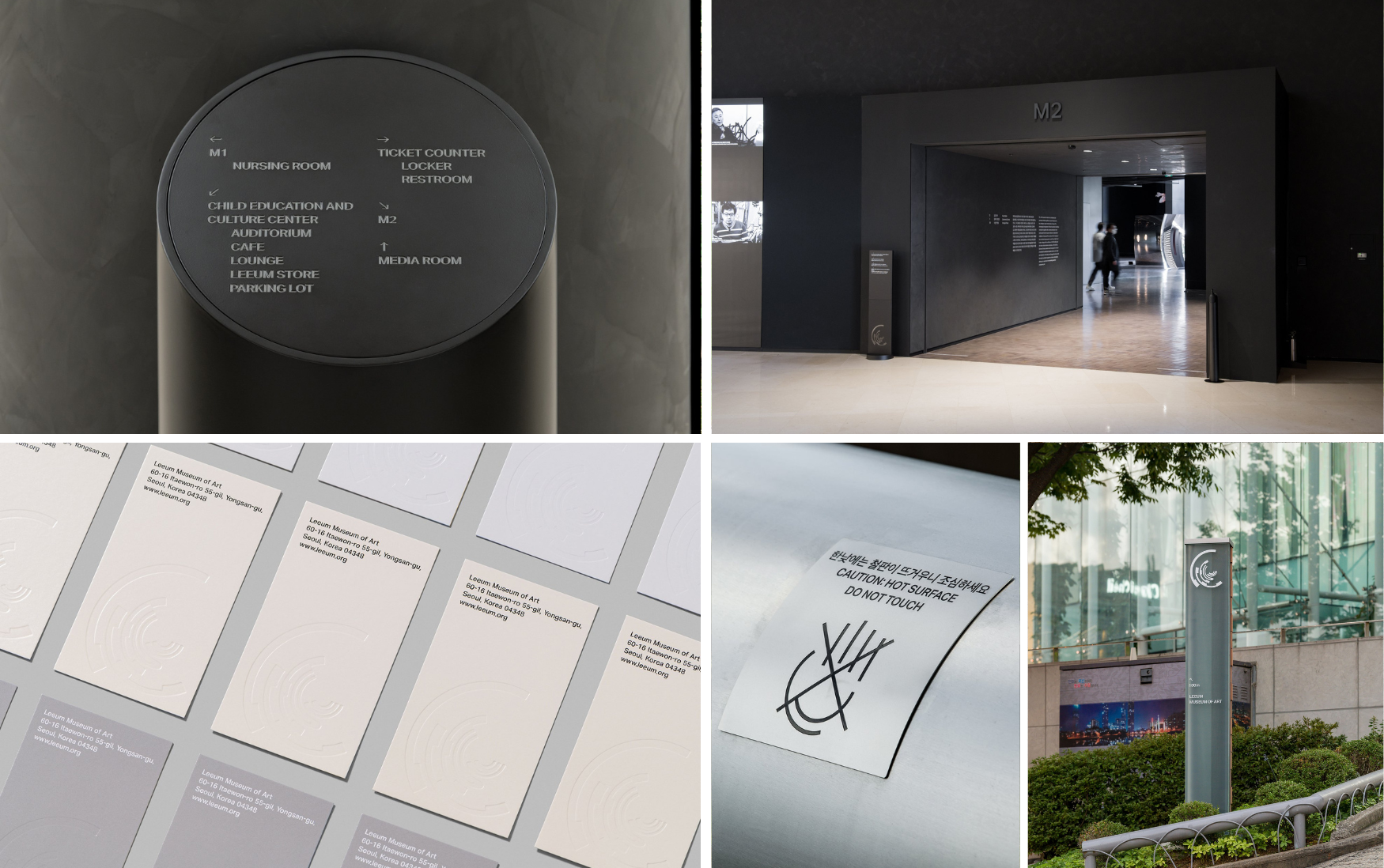
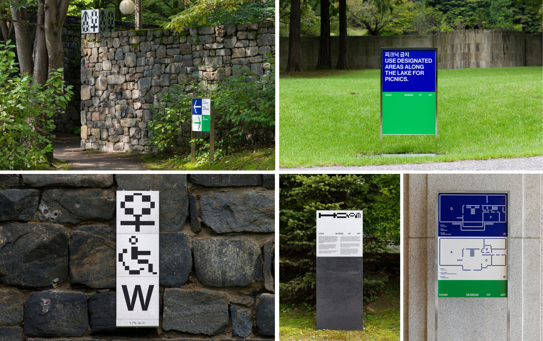
‘Leeum’ and ‘Hoam’ museums offer distinct atmospheres, curatorial philosophies, and spatial experiences, which you translated into contrasting visual identity systems. How did you approach interpreting each museum’s personality and purpose when conceptualizing elements like signage and colour palettes? What creative challenges, or freedoms, did you encounter working with such culturally rich institutions, and how did collaboration influence the final outcomes?
With Leeum, the main challenge was maintaining the iconic singularity of the new symbol across diverse environments without allowing for modifications. There was little room for interpretation or variation, which demanded precision, clarity, and long-term durability in design decisions.
Hoam's project allowed for more exploratory freedom due to its systemic approach. By working with proportional grids (4:3:2:1 and its variations like 3:2:1 or 4:3), the design could adapt fluidly to signage, merchandise, and media. The freedom lay in interpreting this ratio visually across different scales and materials, but it also required careful coordination to ensure the identity remained cohesive and meaningful across all expressions.
The collaboration with both institutions was marked by deep respect for their cultural richness. We often highlighted that the most compelling designs emerge from healthy dialogue and mutual trust. Rather than imposing a visual language, the studio listened closely to the curatorial teams, allowing the museums’ missions to shape the outcomes.
Especially for Hoam, the absence of an explicit directive to align with Leeum’s identity allowed the team to focus on what was uniquely Hoam: its landscape setting, its historical depth, and its transitional vision bridging the past and future.
How do you balance an artist’s or brand’s existing personality with your own creative direction, and how do you navigate feedback and expectations from both internal teams and clients throughout the process?
Everything we create is always premised on sharing with others. That’s why, at the beginning of each project, we engage in deep and focused conversations with our clients. Through this process, we clarify what needs to be preserved and what goals we want to achieve. We also discuss together what elements should be fixed and which can remain open and flexible.
When we encounter unexpected challenges during the process, we exchange opinions as they arise. Rather than relying on the reasoning of “this is how it’s always been done” or “it’s customary,” we make decisions based on the original goals and framework we set together. At times, we steer in a more grounded direction; at others, we expand the scope. Recently, more and more clients have approached us after seeing our work, already open to trying new approaches. Thanks to them, we’re now in an environment where we can experiment with even broader possibilities.
Your studio often exists between the worlds of cultural and commercial projects. What are some recurring challenges you’ve encountered in navigating that space, and what makes it meaningful or rewarding for you as designers?
Rather than dividing our work into categories like commercial or cultural, we place greater importance on the attitude we bring to each project’s unique relationship. Every project forms its own dynamic between the client, us, and the audience. Within this relationship, we find joy in learning something new and attempting expressions different from our past work. Above all, we feel a deep sense of fulfillment when the outcome we proposed gains the agreement of everyone involved and comes to life.
Korean design is gaining global recognition, especially through music and media. How would you describe the voice of contemporary Korean graphic design, and where do you hope it’s headed? Have you noticed any recent shifts or patterns in the design world that excite or concern you? As designers deeply rooted in Korean visual culture yet globally attuned, how do you navigate the balance between drawing from global influences and staying grounded in your local context?
We feel that we are living in an era where individual values and tastes are becoming more important than region or language. Amidst these changes, we believe that Korean content—imbued with unique perspectives and expressions—is resonating globally and drawing increasing attention.
The difference between the global and the local lies simply in the different cultural contexts and shared norms each assumes. Thanks to technology, these differences have become a source of enjoyment rather than inconvenience. At the same time, AI is now at the center of rapid change across all fields, including design. We are not only using it as a practical tool but also actively incorporating it into the way we think. This collaboration pushes us to reexamine ‘what it is that only we—as humans or as our studio—can uniquely offer.’
Having worked together for over two decades, what have you learnt about sustaining a creative partnership over time—especially in a field that evolves so quickly?
A curiosity for new fields and projects that spark interest in the moment. A respect for difference, and yet a shared effort to bring a single outcome into the world. Rather than chasing high efficiency, we pursue high efficacy and a sense of fulfillment.
Could you share a bit about any recent projects?
The brand renewal of ‘nau’, a company committed to sustainability.
In the early stages of the project, we engaged in conversations with a wide range of stakeholders—including the founder, owner, key decision-makers, and working-level staff. As we followed the unique charm and story of the brand, we came to the conclusion that not only its identity and visual output, but also the direction of the business itself needed to evolve. Our proposal resonated with them, and the brand underwent a comprehensive transformation. Through this project, we experienced firsthand the powerful synergy that emerges when a brand's philosophy, actions, products, and visual identity are all linked and in sync.
Ordinary People has helped shape the visual identities of some of Korea’s most prominent cultural exports. What does that responsibility mean to you as designers? Over nearly two decades, has there been a defining moment or project that marked a turning point for the studio? Looking ahead, how do you envision the next chapter unfolding?
The fact that we are able to contribute to the creation of a “representative Korean cultural content” is both joyful and deeply appreciated. While the scale and symbolism of a project can naturally heighten our sense of responsibility, we’ve never approached our work by prioritizing one project over another. Instead, we focus on three core principles that guide our creative process. First, we ask whether the project involves a new kind of attempt—something that challenges us to think differently or explore uncharted territory. Second, we ensure that every element has been thoroughly considered, from the smallest details to the overarching structure. Finally, we strive to make sure our proposals and outcomes clearly communicate our interpretation and concept, allowing the work to speak with intention and clarity.
There have been a few key moments that shifted the trajectory of our studio: the “We design posters” project from our undergraduate days, identity work for the National Folk Museum exhibitions, and the “MBC Graphic Identity Renewal” project. Each of these led us to meet new people and expand the scope of our work.
Currently, we’re collaborating with ten members across Korea and the U.S., and our ways of communicating and working together have evolved significantly since the beginning. Moving forward, we hope to find continued fulfillment in creating diverse results with a growing variety of members.
What are your studio’s long-term ambitions?
Our goal is to keep creating compelling work alongside diverse collaborators, including team members and external partners. Rather than thinking of it as a way of giving back to society, we see it as a natural flow — a desire to share knowledge and experience. Currently, two of our members are teaching at universities, and we aim to participate in opportunities where we can share our story, such as guest lectures, workshops, and interviews.
We’re not sure what form it will take, but just like our past self-initiated projects, we plan to keep trying to directly plan and produce our own content.
Lastly, for young creatives trying to find their voice and looking to build a lasting practice in design, what’s one piece of advice you always return to?
Create something right now. And show it to people. More than a single great outcome, it is the ‘act’ of consistently creating and sharing that marks a true beginning.
From humble beginnings as a group of college friends designing posters for local events, Ordinary People has grown into one of Korea’s most influential design studios, shaping cultural and commercial landscapes. Over nearly two decades of collaboration, experimentation, and reflection, their work continues to expand the possibilities of what design can express and enact.
As their journey unfolds across borders and mediums, Ordinary People remains a powerful voice in contemporary Korean design—connecting people, shaping identities, and imagining new possibilities.
How about this article?
- Like10
- Support2
- Amazing8
- Sad0
- Curious0
- Insightful0